Intro to control elements
Control elements (controls) and data elements work hand-in-hand. Data elements display the data, and controls manipulate the displayed data by filtering and/or using parameters. Controls are basically filters, and sometimes the terminology is interchangeable.
Note: Instead of supplying a control for your viewers to use as a filter, you can create a filter directly on a data element. For more information see Data Element Filters.
Edit controls in Edit mode. Use controls in View and Explore mode. For more information see Workbook Modes: View, Explore, and Edit.
How Controls Work
Workbook creators add controls to a workbook to manipulate the workbook's data based on user input.
Behavior when Viewing or Exploring a Control
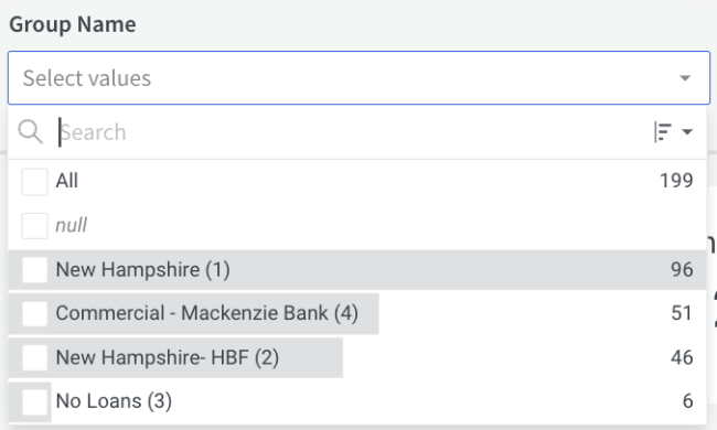
If you are a user viewing an existing workbook, without permission or intention to edit, changing the value of a control element automatically updates the data displayed in any elements targeted by that control. For example, a List control shows the filter values from which you can select:
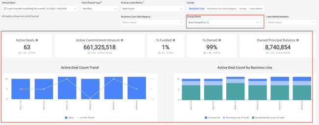
The targeted data element updates to show the filtered results:
If you are exploring, changing a control's input value without actively publishing the workbook only affects your current view of the workbook and its data.
Searching Lists and Their Results
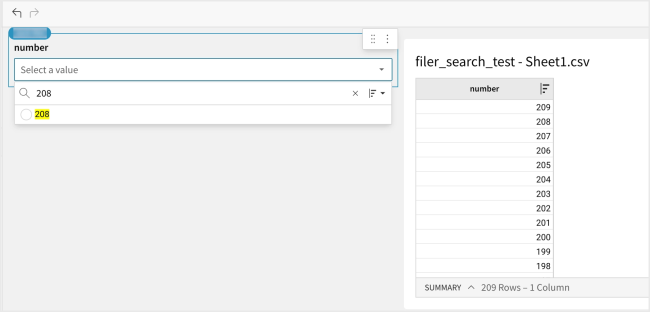
The List control has an optional search box with a built-in initial limit of 200 results. However if you enter a value over 200 and that value exists in the source, then Built shows it in the results.
Options for Configuring a Control
You define a control by setting its type, settings, and target data:
-
Control type: Control types include:
-
List
-
Text input
-
Number
-
Date
-
Date range
-
Top N
-
Drill down
-
Switch
-
-
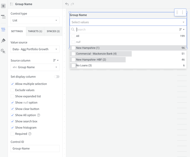
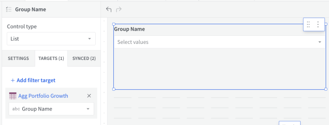
Settings: Settings vary depending on control type. For example, lists require source data but date ranges do not. For example, here are the Settings for a List control:
-
Targets: Targets are the data elements that connect to a control element. The user selects a value from the list, and the list of values comes from the target.
-
Filter: The Add filter target option lets you pick a column to use as the source data for the filter. For example, this filter uses the [Group Name] column, so that the user can filter a table or chart based on the Group or Branch:
-
Types of Controls
Built provides the following controls.
List
-
Description: By default, selected values are included; all other other values are excluded. You can switch to exclude selected values by checking the Exclude values field.
-
Input Type: List of selectable values
-
Column Types: Text, Numbers, Dates
-
Maximum Number of Values Displayed: 200
-
Sort Options: Descending by count (default), Ascending by count, Descending by alpha-numeric, Ascending by alpha-numeric
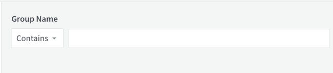
Text input
-
Description: Allows the user to search for full and partial matches between your input text and your data’s values.
-
Input Types:
-
A list of operators to match on, including Contains, Starts with, Ends with, and Like, plus the value excluding counterparts, including Does not contain, Does not start with, Does not end with, and Not like.
-
A text input box for search text
-
-
Column Type: Text
Number and Number range
-
Description: Number is a single number value. When the Select range option is checked in SETTINGS, only values within the selected range are included in the results. The range is min/max inclusive.
-
Input Type: Min/Max numeric input boxes
-
Column Type: Numbers

Date
-
Description: A single date to use as a parameter value. Both fixed and relative date types are supported.
-
Input Type: A calendar date picker

Date range
-
Description: Only values within the specified range are included in the data. The range is min/max inclusive. Both fixed and relative date types are supported.
-
Input Type: A single input box with the option to select fixed and/or relative dates for both min and max values
-
Column Type: Dates

Top N
For more details about using Top N see Top N Filter.
-
Description: Ranks and limits data in the column based on your specifications.
-
Input Types:
-
A list of rank order/direction (e.g. First N)
-
A numeric input for number of values to include
-
-
Column Types: Text, Numbers, Dates

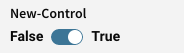
Switch
-
Description: Allows the user to switch between True and False values.
-
Input Types: Switch toggle
-
Column Type: Boolean (true/false)
Requirements
To create a control:
-
You must have a creator license and the workbook must be saved to your team or My Documents folder.
-
The workbook must be in Edit mode.
Create a Control
| 1. | If you are not already in Edit mode, click Edit. |
| 2. | In the editor panel's sidebar, click + Add Element. |
The ADD NEW panel opens.
| 3. | Under CONTROL ELEMENTS select a control type.The new control appears on the page. |
| 4. | Use the SETTINGS panel to configure the control. |
| 5. | Use the TARGETS panel to select the elements to be controlled. |
-
To use a filter, select Add filter target.
Convert an Existing Element Filter to a Control
The Convert to page control option creates a copy of an existing data element filter (filters created directly on visualizations, tables, and pivot tables). Built automatically adds the original data element as a target of the new control. You can customize and add additional targets to the control using the editor panel.
When you create a control from an element filter, the existing filter remain accessible. Changing the input value of the filter updates the input value in the control and vice versa.
| 1. | If you are not already in Edit mode, click Edit. |
| 2. | Click the element's filter ( ) button to open its filter popup. ) button to open its filter popup. |
| 3. | Open filter's more ( ) menu ) menu |
| 4. | Select Convert to page control. |

| 5. | Use the editor panel to customize and add targets to your control. |