Building Combo Charts
Combo charts are a type of visualization that use a mixture of chart types. Built combo charts support bars, lines, areas and scatter plots.
Requirements
-
To create a data element, you must have a Creator License and the workbook must be saved to your team or My Documents folder.
Workbook prerequisite
Before you can build a Combo chart, you must add a new visualization element and select a data source.
At the core of every visualization is an underlying data table (derived from the data source) that supplies the information visualized by the chart. As you build a combo chart, Built automatically groups, aggregates, and calculates the underlying data to create source columns for various visualization properties. You can view the underlying data table while configuring the chart to see how the data is applied.
Plot a Combo Chart
Visualizations can be created via the PAGE ELEMENTS section of your workbook's editor panel or directly from an existing data element.
Visualized data will not display on the page canvas until all required plot fields are defined.
Add columns to open fields using either the field's + menu or dragging and dropping the column.
Fields
-
X-AXIS (1 column)
Data is first grouped by the column on the X-AXIS.
-
Y-AXIS (1+ columns)
Columns added to the visualization’s Y-AXIS are aggregated by default. Aggregation type (e.g. Sum vs Count) is dependent on the original column’s value type.
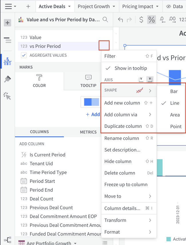
By default, the first column placed on the y-axis is displayed as a bar chart, and all additional columns are plotted as lines. However, each plotted column's SHAPE can be set to any of four options – bar, line, area, or scatter – from its column menu (see Change a Column's Shape).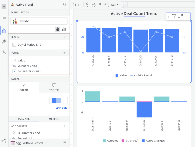
Format Options
To begin editing a visualization’s format options:
Before you start: This action uses the editor panel. If you have not done so already, open the editor panel from either Explore or Edit mode; see Workbook modes.
| 1. | Select the paintbrush icon in the side navigation. |
| 2. | Select a format option to view and edit its settings. |
The following format categories are available for combo charts:
-
BACKGROUND: Display a background color behind the chart.
-
TITLE : Choose to display or hide the title on the chart or to rename the chart.
-
X-AXIS : Configure X-Axis title, labels, and scale. Show or hide gridlines.
-
Y-AXIS : Configure the Y-Axis title, labels and scale. Show or hide zero and gridlines.
-
LEGEND : Show or hide the legend and format the text and position.
-
GAPS : Set the gap width between bars on the chart
-
REFERENCE MARKS : Display a reference line or band based on a set value, various aggregation methods or a custom formula.
-
Trend Lines : Add one or multiple trend lines based on the given data. Select a model to derive the trend (e.g. Linear, quadratic, logarithmic etc.)
-
DATA LABELS : Show or hide data labels and format how labels are displayed
-
AREA/LINE SHAPE : Format chart's comparison line
Change a Column's Shape
Column's plotted on a combo chart's y-axis can take one of four shapes: bar, line, area, or scatter. Follow the steps below to change a column's shape.
Before you start: This action uses the editor panel. If you have not done so already, open the editor panel from either Explore or Edit mode; see Workbook modes.
| 1. | In the editor panel, hover over the column, and click its caret caret icon. |
This will open the column's menu.
| 2. | In the SHAPE submenu, choose Bar, Line, Area, or Point. |